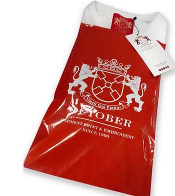
October is a t shirt printing, screen printing, garment sourcing and embroidery supplier established in 1990. We source a wide range of clothing and accessories to fit the most demanding of specifications. Although we print and embroider for a variety of sectors, our speciality is fashion.
With this in mind we offer a full service including garment sourcing, graphic design input, range development, technical screen print and embroidery advice, label supply, re-labelling, bagging, swing ticketing and bulk distribution.
This isn't everything. That would just be too massive, but it is a cross section of all our favourite T-shirts, sweatshirts, hoods, polos, hats etc. It's what a pretentious bell end might call a curated edit. Feel free to call us with any questions, and let us know if we left anything out.
It all started 25 years ago. Paul finished a degree in obscure eastern religions, and was surprised to find he couldn't get a job. Not a problem, a friend had a sewing machine,
October is a t shirt printing, screen printing, garment sourcing and embroidery supplier established in 1990. We source a wide range of clothing and accessories to fit the most demanding of specifications. Although we print and embroider for a variety of sectors, our speciality is fashion.
“The Emma Humphreys Memorial Prize honours organizations and individuals who have helped to stop violence against women.
This year is the 10th Anniversary of the awards with over 200 women attending and is set to be bigger and better than ever. Performers include Sheboom-Europe’s largest female drumming ensemble, Andi Osho- Winner of the Nivea Funny Women Awards 2007 and the Urban Gypsies-Tribal belly dancers featured on Britain’s Got Talent.
Limited Edition T-Shirt Collection Presented by Gap and the Whitney Museum of American Art Features the Works of Today’s Most Influential Contemporary Artists
Building on its long history of supporting the arts, today Gap introduced Artist Editions T-Shirts, a limited edition collection of t-shirts designed by 13 of today’s most influential contemporary artists, including Chuck Close, Jeff Koons, Marilyn Minter, Kiki Smith, Cai Guo-Qiang, Barbara Kruger, Ashley Bickerton, Kenny Scharf, Glenn Ligon, Rirkrit Tiravanija, Kerry James Marshall, Hanna Liden and Sarah Sze.
Also visit our main site: www.october.co.uk
t shirt printing, screen printing, embroidery
Paul Stephenson gives his account of Printwear & Promotion 2008
6.15a.m., and I’m woken by a loud purring — it’s my faithful Persian cat, Fifi La Flange, and she’s hungry. Just as well she’s given me the nudge, it’s Monday morning and I’m off to the Printwear & Promotion Exhibition, so better haul my silky PJ’s out of bed and make a start. Staring out the window and starting to focus, I wonder about this year’s industry offering…will there be a decent turnout, what will all the old faces have to say, and will the M42 resemble Morrison’s car park? Plumped up, tautened and with a dewy glow I bid Fifi farewell, and doing that which seems so unnatural, I head for Birmingham.
On arrival I was reminded of how proud I am of the garment decorating posse — you can spot our jeans and T-shirts a mile off, unlike the attendants of the Door Knob Show and U Bend Expo who were also boarding the shuttle bus. I’m not sure which would go first in Stephenson’s Britain, the matching tie and handkerchief combo or those bloody suitcases on wheels — how I watched and prayed that the smart Apprentice contestant lookalikes would lose a wheel on their bag and career into an NEC flower bed, but obviously there is no God, and they made it safely in. In my defence I had a Dalai Lama moment and tried to talk to the man next to me on the bus about sofits, fascias and extrusions…. that’s got to mean I come back as a higher being.
The usual re-enactment of Holiday on the Buses then ensued as we passed Hall 4 for the third time — saying ‘I hate you Butler’ as I alighted proved to be a mistake however as I got the same driver on the return journey, who threatened to ‘drop me off’ in no uncertain terms. Off to a good start then, in we go and time to register. Obviously I’d employed about as much forward planning as Hitler when he decided it was a good idea to send boot-less men into a Russian winter — hadn’t pre-registered, hadn’t got a pen and couldn’t find my glasses. Having probably ticked all the wrong boxes, in I went. Now I don’t know about you, but I then usually spend 10 minutes wondering about how best to cruise the show, and attempt some aisle by aisle plan that will guarantee I don’t miss a thing. And as usual by the time I’ve figured out what I’m doing I’ve bumped into a customer from Cornwall and wandered off, being reminded by him that I’m still the worst surfer they’ve seen in the south west since an overweight sailor was washed up on a log.
Plan out the window then, a random wander, and who should we see first but Mr Roper, authorised dealer of M&R. In a re-run of Crouching Tiger Hidden T-shirt his folding contraption suddenly came to life, and in a blur of karate chops produced a well folded garment. Impressive, and I almost wished we still did large volume printing so I could have one — imagine how neat your wardrobe would be with kit like that. I soon realised that things are going well for Dave as he passed me a bottle of his own brand of mineral water, fresh from the Roper Springs just outside Wolverhampton…We chatted about forums, I met his European counterpart, and in the combined company of 60 years in the garment trade I was immediately reminded of why I come to this show; I was learning things already, that’s what it’s all about.
On my way then, and a trip to the NEC wouldn’t be complete without a cardboard cup of cappuccino — the usual method is to suck the stuff through a pin hole in the plastic lid. You are then led into a false sense of security by the cool froth before being hit with brown molten lava and sustaining third degree trap burns. I try to put the fire out with some polystyrene packing material masquerading as fruit cake and, unable to see properly, decide I’d better find some friendly faces. Clutching my face I career onto the Continental stand. And that’s another reason to come to the show — to put faces to names. I speak to these chaps every day, sometimes even about their T-shirts, which we all know are most lovely and changing the moral and ethical direction of the industry. But a few hours here can somehow humanise the rest of the year’s work, as you’re not just calling an invisible person to order some stock. You now know what Rob Shirley and Mark Zegan actually look like, and dammit they’re handsome (that’ll be a tenner chaps, each, the keys to the TVR and a free box of NO3’s).
Having regained the ability to speak we’re off again, a hand shake from a man who seems to think my name’s Paul Clapham, and I’m in the company of industry legend John Potter, and the machinery guru known only to the chosen few, Professor Kevin Alcock. Now I would tell you about the conversation we had, I really would, and if this was Private Eye it might just get printed, but what I can say is that as I steadied myself against John’s rather spanking new dryer to contain my laughter, I was reminded of a third reason why I come to this show: we’ve got some great characters in this game and I’m always glad to see them, which is more than I expect can be said of the Euro Tool Fest in Hall 2. I chuckled off, had a quick look at the industry awards (nice work everyone), and in need of a hug and a big smile thought I’d better drop in on Glen and Sue from BTC — Sue does the hug by the way. As usual we don’t look at any product, it’s an easy chat, BUT, in that 10 minutes as a result of a few apparently unremarkable comments, I entirely changed my view of workwear and acquired a new long-term objective for my business. Can a few hours out of the office and a chance meeting change your direction and possible success? In the company of people who know what they’re talking about, yes it can.
So I’ve meandered around the show, and you’ll be forgiven for thinking I’ve meandered about this article but there is a point. When disgruntled of Chipping Sudbury talks about the Printwear show they say things like: “The parking was £8.00 you know, and there were fewer exhibitors than last year; there were hardly any new products and the lanyard for the name badge has aggravated my eczema”.Well maybe that’s not the point — look beneath the surface, and there are a few hundred years worth of combined knowledge in that hall, poised and waiting to share it all with you. As important as the shiny new equipment and the new bobble hat with three ear flaps, in fact more important, are the relationships — creating new ones and cementing old. And that’s why I’ve been out too long, and that’s why I’m happy to pay £8.00 for parking, and that’s why Fifi has made fluffy love with two cushions, a chair leg and a sock.
Cheers,
Paul
Graffiti writing dates back many centuries, even back to Roman times when art work was scratched in and painted on to walls.
In modern time graffiti writing and graffiti street art became much more than just decoration. Graffiti writing became an outlet for political activists to express themselves and also as a way for every day people and artists to express themselves.
It turned decrepit walls into beautiful pieces of artwork and quickly ingrained itself in many subcultures, eventually becoming a world wide art form. Many modern artists have roots in graffiti and the art form has worked its way into many other areas such as graphic design and photography.
Graffiti writing and graffiti street art have become one of the most popular subjects for photographers to shoot, as seen below in these 30 great examples.
Examples of Great Graffiti Writing and Graffiti Street Art
The HOT colour of the year according to Pantone® is Chili Pepper Red 19-1557 TCX
This case study will give you a look at the process of successfully developing a colour from the design inspiration to the final article in the retail store.
Once you have selected the colour from the Pantone Fashion and Home Colour System® and ordered your standard swatch card, you may go to www.matchpantonecolors.com and request a user name and password to access the formulations page. At the formulations page you will be able to request a starting recipe using Clariant globally available colorants to match the colour on your particular fibre. The fibres with starting recipes at the site are cotton, nylon, and polyester.
The recipe and the standard are all the mill will need to get a SMART start on a successful colour approval going into production.
If you are creating a special fibre blend or application or need technical advice, contact our technical support team. Select the country contact from Clariant and they can assist with combinations for your unique blend or processing information for the best results in the mill.
Yves Saint Laurent, considered by many as the greatest fashion designer of the 20th Century, has died in Paris at the age of 71.
Saint Laurent changed the face of the fashion industry when he became chief designer of the House of Dior at 21.
He designed clothes that reflected women’s changing role in society: more confident personally, sexually and in the work-place.
He retired from haute couture in 2002 and had been ill for some time. Saint Laurent died on Sunday evening in the French capital, the Pierre-Berge-Saint Laurent Foundation announced.
Pierre Berge, the designer’s former business and personal partner, said he had died at his home after a long illness. He did not give details. French President Nicolas Sarkozy paid tribute to Saint Laurent’s “creative genius”.
‘I draw on woman’
“I found my style through women,” Saint Laurent once said.
“That’s where its strength and vitality comes from because I draw on the body of a woman.”
He changed forever what women wear, introducing trouser suits, safari jackets and sweaters, BBC arts correspondent Razia Iqbal notes.
Saint Laurent was a great innovator, helping to revitalise haute couture while making ready-to-wear design popular.
The editor of British Vogue, Alexandra Shulman, said he had helped democratise fashion:
“Before that people had small salons for rich people.
“Saint Laurent brought it to the people.
“He was young and groovy. Pop stars were hanging out with him and younger generations related to him.”
‘Devastating’ news
President Sarkozy said the designer had been “the first to elevate haute couture to the rank of art and that gave him global influence”.
YSL ‘understood what women really wanted’
“Yves Saint Laurent infused his label with his creative genius, elegant and refined personality… because he was convinced that beauty was a necessary luxury for all men and all women,” he added.
Speaking on French radio, Pierre Berge said his former partner had empowered women.
“In this sense he was a libertarian, an anarchist and he threw bombs at the legs of society,” he said.
“That’s how he transformed society and that’s how he transformed women.”
Famous French embroiderer Francois Lesage, who worked 40 years with the designer, said he was “devastated” by news of his death.
“I have never known a designer who would give so much thought to something when it was proposed to him,” he told French TV.
“It is a great grief for me.”
Life of ill-health
Born in the Algerian city of Oran at a time when the North African country was a French colony, he had a precocious talent.
His first collection caused a sensation with its gently flared dresses and jackets that set the mould for 1950s fashion.
Within three years, Dior had died and Yves St Laurent had taken his place. He took the world by storm with his trouser suits, highly coloured ethnic prints and designs inspired by the art world.
Taunted as a schoolboy because of his homosexuality, Yves St Laurent suffered mental and physical ill health for much of his life and he appeared in public only rarely.
Did you know the designs of Yves Saint Laurent? Are you a designer who was inspired by him or did you work with him? Have you ever worn one of his creations?
What contribution do you think he made to the fashion industry?
I’m a bloke, and as such when it comes to taking out the recycling I’m unable to make several sensible journeys. Firstly I collect all the tins and cereal boxes, and build an eight foot structure that resembles the Manhattan skyline.
Then after some preparatory blowing I attempt what I believe in weightlifting circles is called the clean and jerk. Propelling myself at speed and fueled by foul language I then career towards the bins. There can be only one outcome, and within seconds I’m wearing a pair of cornflake box slip-ons and fully drizzled in tuna oil.
Marvellous — another day smelling like I’ve spent the night in Captain Birdseye’s bunk. And so it’ll come as no surprise to you to hear that although well intentioned, I’m not the world’s most successful eco warrior. To such an extent that I swore that the only article on green issues I would ever write would be the boys book of bogey flicking……and yet here I am, about to join Gordon Ramsay in discussing carbon footprints, (although unlike Rammers, I don’t have a restaurant at Heathrow).
Nowadays you’re supposed to know all about your biodegradables, your biomass and bio fuels: the carbon offset, the carbon tax, and as for carbon trading well that’s all pretty damn straightforward. Then all we need to do is have a quick look at our micro generation and our sustainable development, and it’s home in time for a bag of mung beans and a glass of goat wee. I’ve got energy saving light bulbs dangling from the ceiling like sci-fi haemorrhoids; I’ve sold the guzzler and travel to work by donkey: and all my printers are in a home made bum sling, piped up to a methane converter that runs two autos and a dryer….my work is done…well, not quite, and there’s a reason — I’m still trying to get my head around the idea of eco friendly inks, and before I go on, I ain’t no chemist but…..
You’ve purchased your planet saving T-shirt, a subject I shall leave to the learned Professor Charles of the Continental University, and then you arrive at your printer full of good intentions:
You want water based ink. And why wouldn’t you, anything with water in the title has got to be good right? In some ways yes, but has a printer ever told you that to cure water based inks we run our dryers at less than half the speed, I guess using double the gas? Does that mean our carbon footprint has increased? I presume it does.
And while we’re in our cloud of noxious water based vapour at the Joker’s lair, I’d better confess that no matter how good we think we are, when we use water based inks we spend more time colour matching, have more screens break down and generally faff about like grannies in a factory outlet. It can take us up to twice as long to run a job…….and so we use more gas…. and the sun sets over another melting igloo.
And when we’re not sloshing about in the water based we’re whipping up a discharge cocktail for all your lovely dark garments. It really is brilliant stuff — when you print it you can’t see anything and then at temperature in the dryer, abracadabra, the reactive dye is removed leaving a bright and texture free print….rub it on your face and go mmmmmmm, after you’ve waited a few minutes for the formaldehyde to evaporate of course. Ah good old formaldehyde, fairly harmless and great for embalming bodies, but it’s a skin irritant so printers beware.
And when our ink maestros have finished with the above, they pour the waste inks into air tight containers and rocket them into outer space where they can do no harm. Under no circumstances are water based inks washed onto the water table — if you had a blue cup of tea this morning, don’t blame your local T-shirt printer.
But water based is better than solvent based isn’t it — we’ll I guess so. Solvent based inks have PVC in them, which sounds unnatural to my un-scientific mind. And if that really bothers us I expect we’ll be insisting on the re-introduction of walnut dash boards on our motors and ripping out our PVC windows….and then it’ll get a bit draughty, we’ll put up the heating, and I think I just saw a Toucan in my back garden.
And if you can say it, don’t forget to ask your local printer about phthalates — there are 6 of them I believe, one of which appears in some solvent based inks. As far as I know they’re banned for use with children’s clothing — I’ve got kids and I don’t want any of them growing a third testicle, so right behind that one. Having said that phthalates are a plastic softener, so guess what your cling film is full of — quick, to the gents and inspect your wedding vegetables!
This is all serious stuff though, and my flippancy is only an unconvincing mask for my confusion on the subject.
The ink companies, of course! They will know the answers, and so I arranged to meet an ink guru in a lay-by on the A416.
’The water based is drying quickly in the screen’ I said…
‘But not if you spray it with a water mister from Wilco’s’ he said…
’Dmitri’…
’Vladimir’…
And we shook hands.
Well it wasn’t quite like that, but a document did fall into my pocket, genuinely, and at the risk of sending you into a coma may I quote,
‘With more than 10,000 raw materials, the majority being preparations and mixtures of substances, with long and complex supply chains, it is not feasible for us to obtain guarantees of registration and pre-registration for every single substance at each and every stage of the supply chain all the way back to crude oil or mineral or vegetable feedstock. To attempt to do so would imply a significant resource and added cost that would be unacceptable to our customers’….when I click my fingers you will regain consciousness.
Basically, I think this means that the idea of tracing what’s in stuff and where it’s from is just a touch complex, costly and at the moment unlikely. And on top of all that,
‘In many cases full compositional information is considered to be confidential business information’ So, I presume that means ‘If we did know what was in it, we may not want to tell you’.
Sounds a bit Bond villain perhaps, but is this just the harsh reality of where we’re at today, and is it more honest to admit this than just join in with the greenwash?
And the ink companies are hardly being helped by some of the certifying organisations — 50 grand to licence one product for 18 months! That just isn’t going to happen unless you want to start paying 100 quid for your printed T-shirts. So who’s really pushing the pedal and sending us into the piranha tank?
‘Organic’, as a chemist called Malcolm recently said, ‘is a vague and contradictory term. In it’s current context it is directed at produce manufactured without chemicals, in which case it can hardly be applied to chemicals. But peculiarly, most chemicals we use are organic, as they are carbon based’ ……at which point he stepped through my wardrobe and returned to Narnia.
None of this is a reason to stop trying; I live next to a river and would rather avoid the UK introduction of malaria. So by all means give the Soil Association a call (although as far as I’m aware they won’t accredit your inks). Buy yourself a Prius and plant a tree, it can only help, but if you want a final answer on inks all I can say is, we don’t print with spring water and mango juice, so perhaps the jury is still out.
That said, if you need me for anything I’ll be by the bins wearing a yoghurt pot.
Paul Stephenson
paul@october.co.uk
www.october.co.uk
Tshirt printing, screen printing, embroidery To be remarkable
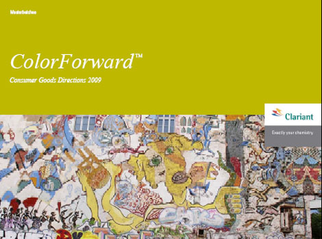
ColorForward 2009 | Global Color Forecast and Trend Inspirations
Awareness of Global Connectedness and Environmental Responsibility Projected to Drive Consumer Colour Preferences
Strong feelings about increasing cultural unity and personal commitments to a better environment can be expected to make consumers more receptive to bright, layered colors, contrasted with earthy, neutral tones, according to the 2009 edition of ColorForwardâ„¢. This Clariant Masterbatches color trend analysis and design tool is released annually to help designers and marketing professionals make informed color choices. ColorForward 2009 is the collaborative effort of color specialists from North and South America, Europe and Asia. It is an invaluable service available through Clariant’s global network of ColorWorksâ„¢ design & technology centers.
Each year, the ColorForward team explores global cultural influences and lifestyle trends to gauge their impact on color directions for future consumer products. “These color forecasts are meant to be used as a guide, linking color preferences and social trends and showing how these relationships impact the path of color trends.” explains Carolyn Sedgwick, Clariant ColorWorks Business Manager. “ColorForward does not tell you what color to choose. Rather, its goal is to provide information and inspiration that can be interpreted, adapted and applied to suit individual marketing objectives and product requirements.”
The 2009 edition of ColorForward focuses on four key societal trends:
– Grow Your Own Future recognizes that people have begun to take personal responsibility for environmental issues, making positive changes to improve the world we share.
– Global Repositioning acknowledges the growing influence of Asian traditions and cultures as well as the enhanced cross-cultural connections made possible by the Internet and modern communications media.
– Duality develops from the way in which people today accept and even celebrate multiple facets of their own personality, embracing opposing concepts and synthesizing different ideas and influences into a new whole.
– Mosaic reflects how strict global identities are loosening their hold on people, allowing enlightened intermingling of ideas and ethnic influences without losing unique cultural roots.
Linking Color to Cultural Trends
Once they identified the societal and mass-market concepts that can be expected to resonate with consumers in 2009, the ColorForward team considered how these ideas are likely to play out in color.
“People tend to respond well to colors that reflect the broader influences on their lives,” explains Cristina Carrara, ColorWorks Designer. “Since brand managers are working now on products and packaging that will be on the market in 2009 and beyond, we need to help them anticipate which colors will be most effective in gaining consumer attention a year or more from now. ColorForward 2009 identifies a total of 20 colors — four basic colors and one effect color for each of the four societal and lifestyle trends.”
To represent Mosaic, for instance, Clariant selected strong saturated hues including All Night Long dark blue, Pumpking orange and Leaping Leprechaun green. Carrara notes that each color is strong and independent, but works well when balanced with other colors in the global palette.
The Duplicity family includes both brilliant, vibrant colors and contrasting light, neutral shades. Here Carrara points to Isis, a very light blue/green that expresses a quiet state of mind, while Lolita is a vibrant, glossy, somewhat ironic fuchsia. Other colors in this group include Insomnia, a mysterious blue/purple, and Bosporus Dusk, a neutral light blue/lilac.
The 2009 edition is the first ColorForward release to include special effects that incorporate non-color ingredients that add sparkle, reflectivity, depth and other qualities to enhance the base color. For instance, in the Mosaic group a pink pearlescent is added to white to yield an effect called Dessert, while the Duplicity effect color is called Velvet Fog. Carrara describes it as “a deep gray with purplish interference that seems translucent, but which develops more depth and character when viewed from a different angle.”
Clariant offers ColorForward seminars at the seven ColorWorks locations as well as at selected conferences and customer sites. The ColorForward social trend themes, images and color directions are also captured in a handsome booklet along with a set of polypropylene color chips to provide a tactile experience.
Clariant Masterbatches products are marketed under six global brand names: REMAFIN® masterbatches for olefins; RENOL® masterbatches for engineering resins, styrenics and PVC; CESA® additive masterbatches; HYDROCEROL® chemical foaming and nucleating agents; OMNICOLOR® universal color masterbatches; and ENIGMA® special effects. These brand names and ColorForwardâ„¢ and ColorWorksâ„¢ are all registered trademarks or trademarks of Clariant. More information on Clariant Masterbatches products is available at www.clariant.masterbatches.com.
The positive influence of sport revitalizes the codes of urban chic. The functional wardrobe, technical fabrics and details with an «active sport» connotation come into play for very cool fashion.
Culture of paradox, play of contrasts, new aesthetic rules. Heritage resources are drawn on to embellish and dream up a modern and effortless wardrobe. Unostentatiously sumptuous, floral colors evoke the exoticism and magic of dyes. Contrasting harmonies or faux monochromes are neutralized with faded tones. Light silky fabrics, taffetas, créªpes de Chine, satins. Glossy cottons, cotton sateen. Soft casual wear, heavy canvas, softened washed basket weave cottons, ring spun denim. Linen, hemp, textured rather than rustic! Oversize decoration. Japanese-style florals, plant landscapes, tattoos, bou-bou patterns, Madras checks, knit jacquards with stripe and basketwork motifs
.
I guess you are wondering what does a 3D animator have to do with fashion and clothing design. While in conversation with a friend from Offplan3D (a 3D animation company) the conversation turned to 3D design, websites and fashion.
Just thinking outside the box. Infact, thinking virtually outside the box.
Why shouldn’t the 3 elements meet. The clothing industry has developed a traditional method of displaying garments e.g. catwalks and magazine promos but it has been very unimaginative since. We are looking at fashion display standards from the turn of the century, the last century.
Is it a good business decision? Well there are some downsides e.g. you cannot feel the texture or try on the garment. However if you are selling garments online already what difference does it make as long as the end product looks and acts like the one displayed. If you are looking to sell to distributors or retail outlets then wouldn’t you want to show your product range in the most existing way and get feedback before going to the expense of producing samples or production minimums. In short get the order before making the product.
Designers of today are passionate about there garments and brands however not many can actually display on location or create the mood other than in the imagination, in conversation or using expensive photography. 3D animation of today is advanced and accessible enough to do it justice and able to represent the designer’s vision to the desired audience in a modern creative context. This is not a new idea, just one that has been waiting for its time. The time has come and the technology is finally available.
Check out the Offplan3D website for a flavour of what they have done for Architecture, product design and for broadcast. Fashion has even more potential. Now do you get it. Well its just a thought. What do you think?