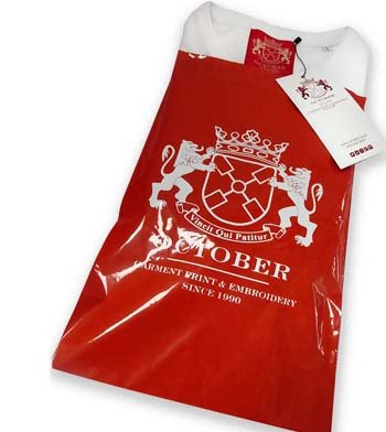
October is a t shirt printing, screen printing, garment sourcing and embroidery supplier established in 1990. We source a wide range of clothing and accessories to fit the most demanding of specifications. Although we print and embroider for a variety of sectors, our speciality is fashion.
With this in mind we offer a full service including garment sourcing, graphic design input, range development, technical screen print and embroidery advice, label supply, re-labelling, bagging, swing ticketing and bulk distribution.
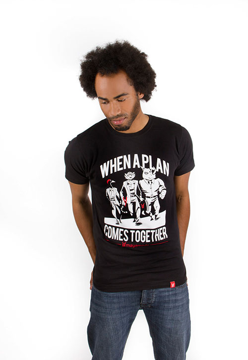
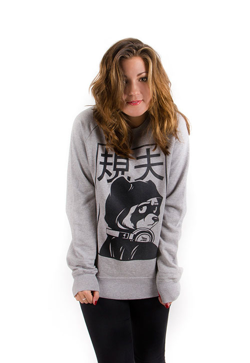
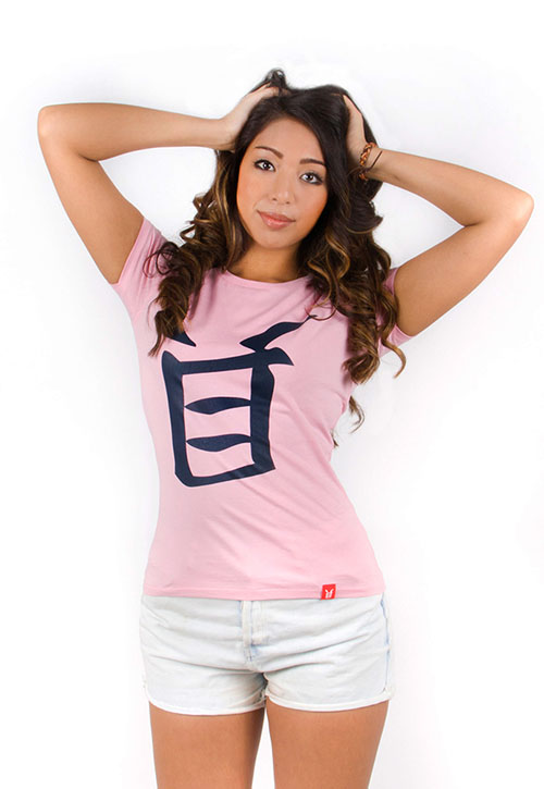
This isn't everything. That would just be too massive, but it is a cross section of all our favourite T-shirts, sweatshirts, hoods, polos, hats etc. It's what a pretentious bell end might call a curated edit. Feel free to call us with any questions, and let us know if we left anything out.
It all started 25 years ago. Paul finished a degree in obscure eastern religions, and was surprised to find he couldn't get a job. Not a problem, a friend had a sewing machine,
October is a t shirt printing, screen printing, garment sourcing and embroidery supplier established in 1990. We source a wide range of clothing and accessories to fit the most demanding of specifications. Although we print and embroider for a variety of sectors, our speciality is fashion.
If it stops moving long enough and we like the idea, we’ll print it…now available from what was once October Textiles Ltd, now October Textiles Furniture and Whatever Looks Like A Nice Thing Ltd…printed coffee tables.
If you already have a one colour design that will be going onto a T-shirt, why not also put it onto a coffee table with our new wood inks…when the conversation looks in danger over mid morning tea and buns, it’ll give you something fascinating to discuss. They will be around £65 out of Nottingham, or £500 when they’ve been talked up and whacked in a Shoreditch interiors showroom…
Hold onto your flat peaked baseball hats, it’s not until next year, but every now and then we’re extra organised and get the good stuff in the diary, with a preview of what’s coming next.
The already successful Performs Polo will be having a trip down memory lane, and going all vintage in four new well washed colours. As will the Strolls sweat, just in two colours, but sensible blue and grey so they will work well. And once the preserve of table cloths, or white wafty posh boy trousers in St Tropez, there is the addition of the ‘Enjoys’ linen T-shirt. Yes, you heard us correctly — it’s a bit see through and saucy, but with the quality of linen that says you don’t go for it on the first date.
So, stand by your beds, and wait for some New year niceness. See catalogue here.
The Badger’s Ball’s, The Squirrel’s Nuts, or The Fisherman’s Crabs, it doesn’t matter what we call it, because it was just another Friday night in a small pub on the edge of town; but we’ll say it was half way up North Sherwood Street, for those of you who know Nottingham.
And it was the usual brewer’s fayre…a minor scuffle over a stray dart, a snoozing local in trap three of the gents, and on the pool table, a large man on all fours shouted ‘NOW’ as his friend flicked a lighter, and a bright blue flame blasted forth from his Wranglers.
In a loved up corner a local bus driver sat, with his shirt undone to the naval, festooned in Ratner’s finest and with an arm around ‘my Vera’.
‘I’d have never effin done it’ she said,
‘Not in a million effin years. If that effin bitch thinks she’s getting away without the effin kickin’ of an effin lifetime, she’s living in cloud effin cuckoo Effinland – I would never have effin done it, effin’
‘Well of course you wouldn’t duck’ he said, ‘and you know why don’t you?’
‘No’ said Vera, ‘Why?
‘Because me likkle ducky, you, are an effin Lady!’
Vera beamed and snuggled up, and through the six quick pints of Home Ales haze, no eyebrows were lifted – dogs slept, ha’pennies were shoved, fruit machines span and all was well, until I said,
‘Well, that’s me. I’m doing up a house in St Anne’s in the morning, I think I’ll have a walk back through the old neighbourhood and kip there, may as well get an early start’.
The room stopped and everyone stared…I felt like a gay bloke in Barnsley.
Bob, the boz eyed barman (you weren’t sure who he was talking to when he said, ‘What can I get you?’), leant over the bar and fixed me keenly with his good eye.
‘You can’t wander about down there any more our kid. It was tartan scarves and Raleigh Choppers when you were a local…the gangs don’t sing Shang a Lang these days you soft sod.’
‘Stuff and nonsense my man, you’re positively blithering’ I said,
‘I know every snickett and ginnell, every cut through and every dog dirty back passage. I can nearly see the place from here; I’ll be home in two shakes of a lamb’s jiffy. I will bid you good evening, and shake the dust of this tawdry hostelry from me new leather Trickers’.
At the door, even Dickhead Dave tried to stop me.
‘Paul, don’t be a knobhead’
‘Are you calling me a knobhead Dickhead?’
‘If you’re walking through there at this time, yes, you knobhead’
‘Night night Dickhead’, I said, and stepped into the street.
The warmth stays with you for a while doesn’t it, inside your coat, and your heart. And for a few moments the faint laughter will cover the sound of your walking, while the lights of the pub will be there to guide you, like a distant harbour, with the promise of rest. But it’s not long is it, until the darkness has you in its glove, and all you can hear are your footsteps, and the sound of your breath.
I turned down Huntingdon Street, right at the Mosque, or is it a bingo hall again, eyes down in prayer either way, and brisk as you like towards Sneinton Market…left at the Bath Inn, bugger me it’s gone, it’s a chippy, bloody hell, but it’s ok, Lymns are still there with a few reassuring hearses, Rolls and Royce ready to waft you to Wilford Hill cemetery, when the clogs are finally popped.
All was going well, gangs, pah, just cut through the old underpass onto St Matthias Street and…shit…they’re either stray monks looking for the nearest monastery, large nuns, a Robin Hood re enactment club…or a bunch of local youths with a fondness for firearms and cutlery…hoodies!
I remembered that old feeling, where there were legs built of muscle and blood, there was cotton wool, and rubber. What were the rules, think man, what were the rules forty years ago, we’ve done this before, the Steve Ellis Gang remember, what did we do, we had two choices didn’t we…run, never good, too vulnerable. They’ll chase you down like dogs. You’ve got to do the walk through, it’s half a chance…look nuts enough to be a handful, they might think twice but if they don’t, just go mad bastard axe man, shout, scream, and try to take the big lad. Or the third choice, talk…no way, and say what?
Strangely, I thought of Billy Connolly, and his idea that when you’re in a tight spot, your first line is all important. Now he of course was referring to being caught kecks to the ankle and todger in hand, in a lonely act of self love. Should you ever be so rudely burst in upon, your opening line is, ‘Thank God you’re here!’ This should throw the intruder into a sufficient stupor, that they’ll then believe you were genuinely trying to brush an aggressive spider from your pants. But what would my first line be?
In the flickering yellow light they spread across the tunnel to say, ‘You shall not pass,’ hoods up and all in black, the Unmagnificent Seven…while into to the valley of death, brick wall to the left of him, brick wall to the right of him and up lad in the middle, rode Mr Knobhead, and with his arse going like a Clown’s lips he said….
‘Pouch pocket, or zip?’
‘What?’ said the kid.
‘Pouch pocket or zip. What are you saying?’
‘This ain’t no f#ckin fashion show you freak’ the kid replied.
‘Well I can see that’ I said…my mouth feeling like I’d just entered a cream cracker eating contest, and lost.
‘What have we got’ I continued,
‘Stussy, ok, Bathing Ape…who’s wearing BBC…there will be one of you, ah yes, there we are, small boy, third in from the left, I can’t see in this light but a red foil print right?’
The big kid laughed…
‘You are one mentally ill motherf#cker, why don’t we just cut you up and do the world a favour?’
‘Because I am involved in making the clothes that you wear?’ I tried,
‘It’s my job. I know you need a nice straight and tailored sleeve, plenty of length down to a wide cuff, none of that wafting about nonsense. A straight body with a wide ribbed hem, so it sits flat on your hip, not too oversized but with room to manoeuvre (I demonstrated). I know you need a 380 gram fleece, minimum, and that in the main you’ll prefer a pouch to a zip – cut me up, and you’ll have nothing to wear but yo mama’s blouse (street talk, fershizzle, no diggedy)…oh, and of course, you’ll want your hood nice and deep to hide your face, so I’m scared of you’
‘You scared of me old man?’
I could see his eyes now, and he smiled…handsome he was, clean skinned and way too good for this place.
‘Scared?’ I said,
‘I either drank too much earlier and put a Big Mac in my pants to keep it warm, or I’m in very serious trouble indeed’
‘Where’s home’ he said, and I pointed,
‘Then you’d better walk with us’ he said…and I did.
At last you find me in my rightful place, up to my duffle coat in wind and drizzled glory, pacing the bridge of HMS Abercrombie and deep in the Bay of Biscay, my exact coordinates, undisclosable. Hedges, my trusty Number One, (and in real life my butler back at Thrumpington Manor) appears at my side…’0400 hours Captain, time for cocoa I believe’…’Your beliefs are as correct and reassuringly English as ever Hedges, make mine a large one, and don’t forget the squirty cream and the choccy topping’.
Sweeping the stacked grey slates of the waves for a lone wolf U boat, I light yet another Capstan Full Strength and wonder, what will he be thinking…he’s beneath me somewhere, running silent, running deep, blonde haired, and with a fondness for leather trousers and plenty of sausage…Jurgen Wolfgangbanger, about to shout ‘Loose’, and blow us all to glory.
The muffled bark of the ship’s tannoy disturbs me from my fevered musings, what was that? ‘Mr Witherspoon, that’s Mr Witherspoon, will you please report to the reception desk on deck 9. Your Cocker Spaniel has escaped from the dog compound and is in the swimming pool, bursting a lilo’
Ok, so it’s not 1943 anywhere outside my 8 year old head – we’re on the 3.30 out of Portsmouth, bound for Santander in Northern Spain on the pensioner’s favourite, the mini cruise, all aboard HMS Pisspants. But it’s the nearest we’ll get, it’s the Atlantic for Christ’s sake, do you need to be a poet to imagine what it was like when the depth charges went over the side, surely, this is not a drill? Well as we sit in the karaoke bar, you need to be more than a poet, a social worker, and a therapist.
First up is Fred, lover of Roxy Music, socked, sandaled, bum bag akimbo, and what does that T shirt say, ‘This is not a bald spot, it’s a solar panel for a sex machine?’ He’s clearly done this before, as he urges us to ‘Come on, come on and stick together’…Freddy, I wouldn’t stick with you if you brushed yourself with honey and sat on my face, so we’re leaving, down to the TV Soap Quiz in the Funtime Lounge, although hold on, wait a minute, there’s a kid with Down’s Syndrome on the dance floor, mike in hand.
‘And now Terry will sing Don’t Stop Me Now, by Queen’ says our compeer Sharon, poodle like, career ended, drugged by the years at sea and in her eyes, all the lights of Vegas, have gone out…so we sit down, and Terry begins. Is he a shooting star leaping through the sky, a tiger defying the laws of gravity? A racing car passing by, like Lady Godiva, is he going to go, go, go…is there no stopping him? Well no – he waves his arms, and sings something that sounds good to him, unaware of the words on the screen, or the screen itself. And while a bunch of middle aged bikers from Rotherham howl with croaky fag fuelled laughter, I look over to his parents in their quiet sadness and pride, and I cry. He’s their Mr Fahrenheit alright, and for that moment before my inevitable descent into self interest, he was mine. Thanks Terry, and God’s speed.
Which brings us neatly onto our subject for today, choosing the right sweatshirt. What do you mean ‘Where’s the bloody relevance in that?’ How dare you! What do you think this is, an empty sham, a hollow facade in which I use the subject of choosing the correct garment for your clothing range, as a flimsy veneer for me to write what the hell I want? Now what I need here is what comedians call a segway I believe, a neat way of moving from one subject to another…aha, I have it! In the fashion game darlings, we often call a sweatshirt a ‘crew’, as in crew neck, and what do you need to run a ship? You see, it may be gale 8 to storm 10, veering west, severe gale 9 to violent storm 11, rain then squally, becoming shitty, but I get there in the end.
To redeem myself, I’m about to tell you the truth and save you googling your nuts off in search of the perfect ‘crew’. There are three available off the shelf in my humble view. They must remain un printed to avoid supplier favouritism, but call me and I’ll whisper their names. This is what you’re looking for.
A straight, narrow and tailored sleeve – not the usual ballooning nonsense, unless your looking for a fresher’s hoody to spatter with Vindaloo and post pubescent fluids.
A wide rib on the cuff – this will elongate the line of the arm, and add, dare I say, a whiff of elegance, avoiding the just got an orange sweatshirt for my new job at the garden centre look.
An even wider rib on the bottom hem – this again lengthens and flattens the fit on the hip, making you look tall, lean, and dangerous…like Jack Pallance as the gun fighting baddy in the film Shane, trust me it’s worth a look, it’s one of Barry Norman’s favourites, and why not.
Go for a decent weight – now two of my recommendations are 280 gsm, grammes per square meter, which is just about enough, and if carbon sueded for extra softness makes for a happier day. But as you know, I’m an old school and chalk dusted kind of headmaster, likely to throw a heavy wooden board rubber. I like weight. In sweatshirts, and guitars, and cakes, so I will always veer towards a 380, or even 400 grammer. Let’s face it, the English winter is colder than the Queen’s pants, you need to wrap up out there and eat your Ready Brek – if we’re selling a sweat, make it something that buyers will pick up and think ‘that’s worth a few quid’…make it blizzard ready.
Do I need extra features, a drop tail, a contrast stitch? Do you cocoa Number One….the right fit, the right fabric, and as they say on the Black Pearl, you’ll be part of the ship, part of the crew….
Michelangelo did it upside down, 200 feet up – is it hard to prepare my artwork?
Good Lord no, not at all…put simply there are Tifs, gifs, AI files, Psd’s, Pdf’s, jpegs, wing dings and sherbet dib dabs…layers, tools, clipping, and trapping and, and, and, and, er…resolution…what could be simpler? All you need to do is become a Grand Wizard of The Order of Photoshop, and you can present your designs in the crisp format required by your lovely textile screen printer, a two minute wait, a ping, and out pop your stunning T-shirts…don’t they?
Well, no, and what follows again is only my view, there are those who will disagree, but unless you have more hours on your hands than a time traveller on the dole, or at least did a few graphic design modules at school, I would think carefully before attempting to master the dark and digital arts.
Why not, it would be like, well handy wouldn’t it? Yes it would, but while you’re spending eight months trying to put your design into layers in the back bedroom, growing a beard, and farting your pants into smouldering tatters, you could have got someone who knows what they’re doing to sort it, and actually be out flogging the stuff.
Self interest, am I about to offer to do it for you, for fifty quid and a packet of Hob Nobs? There is an artwork department here who can, but not me – I tend to keep fairly quiet on the design software subject, as the man who thought that ‘rasterizing’ had something to do with Bob Marley.
What basics do we need to know though, to not waste time cropping the wrong bits off?
Resolution, you need plenty of it – at least 300 dpi’s at the print size, so loads of dots per square inch, or your artwork will look really edgy and not have nice smooth lines. The ‘at the print size’ bit is important – it means you can’t do your design at a really good resolution at the size of a postage stamp, and then want to print a parachute for a charity jump, because your 300 dpi’s will suddenly become bugger all dpi’s, when you blow up the size of the finished print…not enough dots in there, and so suddenly all jaggedy again, like it might have been drawn by a large drunk man in welder’s gloves, holding a small pencil.
This means I’m afraid, that not just for copyright reasons, you can’t go nicking stuff of the internet…it would be nice if we could Google ‘Top T-shirt Designs,’ ‘Massive new fashion label, and ‘Wake up with a super model under a pile of cash in Paris’, and it would all just happen, but generally they’re only 72dpi, and not ideal for print.
Resolution is even more important because of what we’re printing onto – a textile is in print terms, as rough as your Granddad’s chin. We don’t get the lovely smooth glossy paper that your shandy drinking Litho printers get to work with, no wonder they get a nice print finish – no, a textile is a bunch of holes, that will break your dot up if you’re not careful, making the print finish look like a 1970’s holiday snap.
And what’s that someone said about layers? Well that’s how we print most of the time, separating each colour out into a layer in the artwork software thing, so that each colour can have its own screen on the print machine, although not always…sometimes we go all CMYK (cyan, magenta, yellow, black) and mix a load of dots together to create all the colours of a Christmas jumper. Generally if you want strong punchy colours though, save your artwork as separate solid layers, unless it’s a full colour picture, where you’re going to need the CMYK’s to get all the colours, sometimes called four colour process.
But what does layering artwork involve? Here’s a fascinating excerpt from an online tutorial…
Go into the backup layer (Layer Image 1 Copy) and select the blue shape. Copy the shape (Command + C). Switch back to the working layer and paste the shape in-front (Command + F). Make sure you hide the backup layer and select the working layer (top layer). Select the shape. Holding the option key select subtract from the shape area again in the pathfinder palette. Select the shape again and paste a copy in back (Command + B). Select the larger background shape and select the subtract from shape area button….BANG….oh I’m sorry, I’ve just shot off my left testicle… I’m not being much help am I, but I’m afraid I find it about as fascinating as a craft show, and thank god for Phil, my very clever artwork man.
What else before I go and watch some paint dry…oh yes, ‘Can my screen printer help if I just send in a drawing?’ They can indeed…someone once said to me ‘Yes, hurrah, I have my artwork ready!’ and promptly sent me a photo from a phone, of a biro drawing, onto lined paper, that they had just sketched in a traffic jam on the way to see me. One of the lads in the artwork department tried to poison my tea, but it all got printed nicely in the end.
Have I put you off dabbling yet, still want to play with your magic wand tool? Then I will put you onto John Rainsford at the link below. I’ve never met him, but he seems like a damn nice chap to me, solid, Irish, and with a reassuring name…he tells it better than me…I love temperamental old cars more than life itself, but I’m no mechanic… http://www.smashingmagazine.com/2010/12/07/preparing-artwork-for-screen-printing-in-adobe-illustrator/
For many, this is sadly not a consideration at all…if Scruffles gnoshes on your favourite T, grows three goolies and starts walking backwards, who cares, it’s fashion baby, and there will be a few casualties on the way. But for others, in rope sandals and hessian undercrackers, convinced that eating anything other than fallen fruit is murder, it’s a big deal. And so it should be. We may be unsure of exactly which part of the Dagobah system our ink comes from, but we should do our best to find out and offer our customers an informed choice. What follows are a collection of probably half baked truths from the Joker’s chemical lair, but it’s what I’ve picked up over twenty five years of conversations I partly understood. For that reason, we have always tried our best to get it right, without jumping on the green bandwagon…there are those who do, and frankly I’m suspicious of the possibly blow dried villain, selling you a car that won’t break down, because its engine is ‘based on the helical friction principal’, or some other baffling chit chat that you can’t really check up on. As we proceed however, if you are a chemist and think I’m wrong, feel free to enlighten me, just try not to bend me double and take me over the periodic table.
Solvent based inks, also called plastisols…are they the Devil’s breakfast? There are those who have wondered for a couple of reasons. Firstly, Phthalates — these are not a war like inter galactic enemy of James T Kirk, nor a fitness routine designed to locate your pelvic floor, but a plastic softener put into ink to make it more stretchy and printable. A chemist once told me there are six phthalates, three of which are banned, and of the three that remain allowed, one is present in some solvent based inks. So why is that scary? Legend has it that Marks and Spencer once ran a test on these, and there was a suggestion that if a kid chews on a print for long enough, it can have an effect on the growth of their reproductive system. I guess because of its association with children, this had everyone filling the latrines with chocolate fudge, could plastic softeners have this effect? While we wondered, little Johnny was in the corner chewing on a plastic toy from Phthalates R Us, and Dad was off to work with his sandwiches wrapped in cling film, how soft a plastic is that? It all came to nothing, as these things often do, and I haven’t been asked for a phthalate free ink for many years, but it’s always one to keep our eye on.
The other question with solvent based inks is, how easy are they to dispose of? I have been asked at times if it’s true that when incinerated they give off hydrochloric acid. Now any acid is potentially very bad, as I said to a green elephant on the bus last night, but I think our answer to this is, we never incinerate plastisols inks…they pretty much last forever, so we just keep them and use them all up in the end, which hopefully solves that one.
Water based inks and discharge…lovely with nuts, a refreshing summer cocktail? There are those who like the sound of these, predominantly because they have water in the title…fresh from the mountain stream, a squirt of mango to add a little colour, and the whole damn world is safe, right? Well I’ll stick to PG Tips if it’s all the same with you, because the word to look out for here, I’m told, is formaldehyde…isn’t that what they use to embalm bodies, a preservative? I expect so, and that explains why all we printers are so chiselled, youthful, and unable to speak. It isn’t good; you don’t want any on your cornflakes, but are you at risk? Not as far as I’m aware, the danger if there is any is to your friendly printer, and hence we use the more expensive low formaldehyde inks, to make sure we don’t start glowing like we’ve just had a lovely two weeks in Chernobyl.
It is also worth considering if you are an Econaut, that although water based inks sound nice, we put them through a big gas gulping textile dryer at half the speed of solvent based inks…the carbon footprint of a mouse, turns into that of a gorilla…
So, what do you choose when trying to do a nice print, while keeping the penguins in a fully furnished igloo? Water or solvent based? Only my opinion, but it’s six and two threes, swings and roundabouts, six of one and half a dozen of the other, which brings me back to informing the customer as best we can so they can make a difficult but educated choice, and as always, choosing the nicest ink to fit the graphic…As a Libran, I hope that’s a balanced view.
So you have that special sense of who you are, your brand, your identity; you know who your customers are, where they live, and the colour of the curtains in their back bedroom; you know how to reach them in as many ways as possible, website, Facebook, Twitter, dancing girls bursting out of a cake on their front door step; and you’ve chosen your T-shirt, your vehicle, the bill board to express all that you hold most dear (and don’t worry about sweats, hoods, polos, vests, revolving bow ties and velvet ‘Y’ Fronts, we’ll come to them in a later edition). So all you need to do now is slap on some ink, and Bob’s that funny Uncle you never quite felt safe with, you’re away!
Sadly not…to say that ink is ink, is to say that all clouds are the same shape, and that you understand women…they’re not, you don’t, and I must make an ink stained confession here…neither do I.
When the phone rings and you get through to Perky Pete’s Print Palace, you are unsurprisingly talking to a Printer, not a Sub Atomic Particle Chemist who knows the molecular make up of the colourful fluids he plays with. If you wanted to trace the constituent parts of all ink, you would be led on a mysterious Da Vinci Code trip, through thousands of ingredient suppliers back to a petrochemical hole in the ground, five miles from Tel Aviv Bus Station, next to the Falafel Shack. Assuming the ink manufacturers wanted you to know of course, which they don’t, as they build their pencil cases up on their desk to carefully guard their ingredients, their commercial edge over the competition.
Disclaimer over, and if you’re watching Grandma, spark up a fag and smile down from your celestial sofa, I told the truth…but fear not, I do have some knowledge to impart, in part, and impartial…let’s go through the menu.
Plastisol Inks…sometimes called Solvent Based inks — these are the most commonly used — because they’re the nicest? No, because they’re the easiest for us printers to use. They don’t really have a shelf life, any small imperfections on the garment can be removed, and most importantly (and unlike water based inks), they don’t block the design in the screen if you don’t print at warp factor 5. This means your trusty printer can stop half way through a job, pick up his copy of Big and Bouncy, and head off for a nice relaxing thirty minute dump. With that in mind and if you don’t specify, this is what you’re going to get from most print shops unless you ask for something different…so what are its pros and cons?
In its favour, it will give you the brightest colours, the sharpest most graphic line, and the greatest longevity…done right, it will outlast the T. This is largely because it sits on top of the fabric, so it can block out the garment colour behind (stay bright), not have its edges affected by the weave of the fabric (stay sharp), and not allow the fibres of the shirt to come through (and so not degrade with the fabric, after a scrap in the bogs and fifty washes). Properly printed with some plasticising agent (magic stretchy mixture), it will stay pretty much as bright and lovely as the day it was born.
You could say this is a good thing, and it is in certain markets…if you think your customer is fairly mainstream, and could complain if his ink ‘vintages ‘with time…we say ‘vintages’ not ‘fades’ because it sounds better, then this is the one for you – the safe, and sleep like you’re a Peer on expenses in the House of Lords option.
But, and as always, there’s a bloody ‘but’… you’re going to get texture. Now for the New Era 5950 flat peaked drive by doooodes that’s not a problem, they like it heavy, it might stop them getting a cap in their cap, but for the fashionistas, there are few greater blaspheming crimes than texture…they want it nice and soft and fluffy, to gently caress their newly waxed nipples.
So, if you wear your jeans around your ankles with a naval deep V-neck T shirt, what the hell are you going to do? You’re going to ask for…
Water based inks onto light garments, Discharge inks onto darks. What’s the difference? Standard water based inks don’t need the addition of any special dust when going onto white fabric, because they’re not fighting with any background colour…you want a nice red onto white, calm down, you can have one, it’ll look like it just came out the cauldron, but, try and print the same red onto a black T-shirt, it’ll soak in like English rain on Centre Court, and the match will be off. So, you whack in some discharge crystals, and like it says on the tin, the dye of the garment will be ‘discharged’ and replaced with whatever pigment colour we’ve mixed in…nice colour, no texture, happy days on the Sunshine Bus…
But, and as always, there’s a bloody ‘but’ …because your ink has penetrated the fabric, it may lose a little graphic sharpness in your design, it may have some garment colour in there so not quite so bright, and when the fabric is washed and all the fibres stand up and come through the ink, it will ‘vintage’ more quickly…and what’s this I hear about Discharge inks and ‘Colour Shift’…that sounds a bit like Physics; will I end up living in a parallel universe, will my nuts shrink? Ssshhh, ssssshh, now then, now then, then now… it’s ok, but if your garments are from two different dye batches your pinky red could go a touch orangey red half way through the print run, while still using the same discharge ink.
Confused? You might be if we start talking about which inks are kinder to squirrels and don’t kill fish, in the next instalment perhaps…so let’s make it real…we’re down the pub, you’ve ordered a pint of Old Bishop’s Ball Bag (or lager if you haven’t grown up yet), I’m passing you the pork scratchings and you say ‘Paul, I’m lost, I’m empty and aching and I don’t know why’…we’ll come onto that after pint six, but in the meantime what ink do you want!? Are you more All Saints, or more Stussy/Bathing Ape…more English high street or more down with the kids in America? More fashion, or more street wear? If you’re the former, go water based, soft and lovely yaah, if you’re the latter, go solvent, and a bit brighter and sharper, innit, blud, etc.
Or, and you’re going to hate me any minute, more than Traffic Wardens, and those people who know it’s your turn at the bar but still shout their order in first, or those people who don’t pick up their dog shit, and chuck their happy meal bag out of the car window, and say ‘less’ instead of ‘fewer’ and don’t say thank you when you let them into traffic and Christ, hold on, breathe…I’m ok …because you can…mix the two inks….you could have a nice soft water based background texture, with a hard little solvent based ink detail on top to add a point of textural contradiction. How does that twist your melons?
And you might confuse it further, and thirsty after all those scratchings and while ordering a Cré¨me de Menthe say ‘what’s this I’ve heard about high build, gloss, foil, glitter, metallic and phosphorescent ink?’
In the same way I would soothe your fevered brow on the water based/solvent based dilemma by saying are you fashion or street, I would try and ease your special ink effect pain by saying ‘What’s the point’? Unless you’ve got a good reason, like I want a foil here next to this water based ink because the design is about the contradiction of the natural world and materialism, (sounds head up my jacksy but why not) don’t go adding effect for effects sake if it achieves nothing. I expect that from high street multiples who have no graphic heart, and use a load of glitter as a sparkly distraction from their lack of ideas.
One final word – and you can believe this, or call me a sandal wearing bearded tool as you see fit…a good graphic should speak to a good printer, and tell them what ink it needs. As a textile screen printer, one might look at a crisp text based design onto a heavy sweatshirt, and amongst the other songs in one’s head like the theme tunes from Mash, The Persuaders and The Magic Roundabout, they will hear a small voice saying ‘I am solvent based’…or if it’s a gnarly distressed vintage looking image, ‘Hello…I am water based’…mad? Well, we do work with chemicals…
Right then, it’s time for some serious business now, so pull on your Buzz Lightyear Jim Jams, sprinkle some extra marshmallows on your choccy ginger latte, or do whatever you T-Freaks do to get comfy…hoist the sail and swab the poop deck, we are off in search of…the perfect T!
Now we’ve lost many a good man and woman on this crusade – they’ve wandered the world from Kiddermister to Kathmandu, grown beards, got the shits, and been chased by the Mud Men of Borneo, as they scour the globe for that thing that fits the best, feels the best, prints the best, and changes the way the world spins. And you’d be surprised how clear their minds are on the subject — you could send the same T-shirt to ten people, and you would hear reports back that ranged from ‘Thank you for finally making my life complete, this is the most beautiful thing I’ve ever seen, am I allowed to rub it on my face?’ to ‘Why have you sent me this load of old cobblers, I wouldn’t use it to flick the clag nuts off a tramp?’ (more…)
We have covered the conception of this new product range from October Textiles in a recent blog, detailing its inspiration from the film A Streetcar Named Desire, and the effect that Marlon Brando wearing T-shirts in a completely new way (as an item of fashion outerwear) helped the T shirt grow from it’s humble beginnings to the fashion icon it is today.
This was a general overview, so let’s go into a little more detail here:
The Stanley Stella range is at it’s heart fashionable, with a keen eye on current trends to make sure that colours and garment cuts are up to the moment — in addition to this and unlike many brands, these values are carried across the men’s, women’s and children’s products to create a coordinated look.
The quality of these garments comes from an attention to detail throughout production…we are especially impressed by the neatness of stitch detail that can only be achieved by taking time and using factories with high levels of quality control. These details in our view, rival brands which should perhaps remain nameless, whose blank garments sell at extremely high prices.
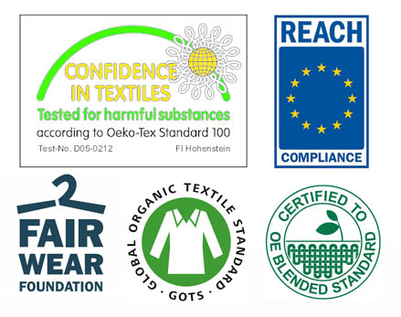
This is added to by sustainable values…everyone says that, but what the hell does it mean? Generally, acting responsibly towards not just the environment, but also towards all the people involved, including being REACH compliant…it means being nice, not because you think it’ll make you money, but because you are. So waste is minimised, harmful chemicals are avoided, and everyone gets paid proper dollar in a safe place. The 100% certified organic ring-spun fibres used are just part of the story, but of course they are a main stay of the range.
From our perspective, we’re happy with this kit because it’s print ready, by which we mean it has a very tight knitted soft and flat surface…essential to get a quality print, especially with any tonal work.
So fashion cuts, beautiful fabrics, and current colours with a conscience…and here are the accreditations to prove it… Goto the collection here.

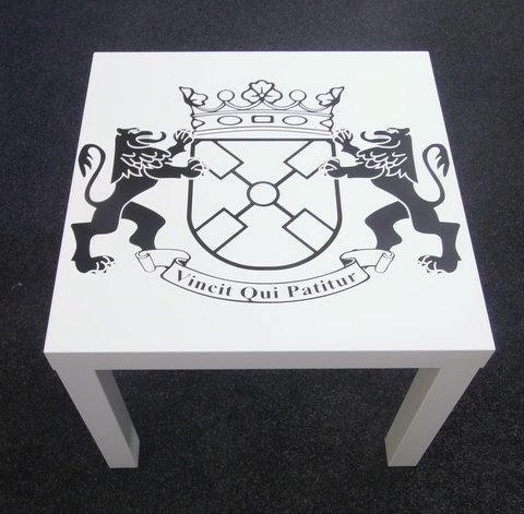 If it stops moving long enough and we like the idea, we’ll print it…now available from what was once October Textiles Ltd, now October Textiles Furniture and Whatever Looks Like A Nice Thing Ltd…printed coffee tables.